Last Updated on January 30, 2026 by Triumphoid Team
Color grading gets “professional” the moment you stop improvising. The pros aren’t magically better at wheels — they run a repeatable pipeline: clean color management, structured node logic, scopes-first balancing, then look development, then scene-level refinement, then QC against the deliverable. Do that consistently and your grades get faster, cleaner, and (most importantly) predictable.
This guide is software-agnostic, but I’ll use DaVinci Resolve terminology because it’s the most widely shared “language” in grading rooms.
The only rule that matters: separate correction from look 🎯
If you mix “fixing the shot” with “stylizing the shot,” you’ll chase your tail for hours.
Correction = make the image technically coherent (exposure, WB, saturation, consistency)
Look = creative transform (contrast shape, palette shifts, halation/grain, film print vibes)
Refinement = scene continuity + storytelling emphasis (faces, windows, skies, practicals, hero objects)
My workflow at a glance (the pipeline map)
Ingest & conform → Color management → Node/Group architecture → Balance pass → Look dev → Shot matching → Scene refinement → Texture pass → QC & deliverables → Client notes loop
Here’s the “what I’m doing on each pass” view:
| Pass 🧠 | Goal ✅ | Typical tools 🛠️ | Common failure mode 💥 |
|---|---|---|---|
| Setup | No chaos later | reel names, flags, markers, groups | grading the wrong cut/version |
| Color management | math is stable | ACES or DWG/CST pipeline | LUT-on-log-without-transform vibes |
| Balance | consistent “neutral” | offset, primaries, scopes | “looks ok” but scopes scream |
| Look dev | define style | curves, contrast/pivot, sat mapping | global look that breaks skin |
| Matching | continuity | split-screen, stills, groups | scene jumps, viewer fatigue |
| Refinement | story emphasis | windows, qualifiers, tracking | plastic faces, crunchy keys |
| Texture | tactile finish | grain, halation, glow, sharpening | overcooked TikTok sheen |
| QC | deliverable-safe | legal levels, gamut check | clipped highlights / illegal chroma |
1) Setup: import, organization, and the “don’t hate yourself later” checklist
Professional grading starts before the first wheel move.
What I do:
- Conform sanity check: correct timeline, correct handles, correct frame rate, correct timecode. If it’s an XML/AAF round-trip, I verify shot order + transitions early.
- Reel naming + metadata: camera A/B, scene/take, lens notes if available. You want to be able to sort and group without guessing.
- Markers as intent: “match to hero,” “fix flicker,” “neon sign clipping,” “skin too magenta.” Intent markers reduce pointless noodling.
- Hero stills: pick 1–3 hero frames per scene (the “north star” shots). You’ll match everything else to these.
Image you can use: “editing workstation / grading vibe” (Unsplash)
2) Color management: pick a pipeline and stop freelancing your color science 🤓
If you want consistency across cameras, scenes, and deliverables, you need an input → working space → output structure.
Two mainstream choices:
- ACES: standardized, cross-facility friendly, great for mixed camera ecosystems.
- DaVinci Wide Gamut Intermediate (DWG/DI): Resolve-native wide gamut + log working space that’s designed for grading headroom and predictable transforms.
The “pro” behavior here isn’t which one you pick — it’s that you pick one and you stay inside it.
What this changes in practice:
You stop “grading into a LUT.” Instead you normalize into a stable working space, grade there, then output transform to Rec.709 / P3 / HDR deliverables cleanly.
Image you can use: CIE chromaticity diagram (CC BY-SA) for explaining gamut triangles and why wide-gamut working spaces matter
3) Node structure: build a node tree that matches how you think 🧩
A node tree is basically your debuggable grading brain. If your tree is random, your grade is random.
My default structure (conceptual, not dogma):
- Node 01: Noise/NR (optional, early)
- Node 02: Balance (offset first)
- Node 03: Contrast shaping (curves / contrast-pivot)
- Node 04: WB trim (tiny)
- Node 05: Saturation mapping (not just a slider)
- Node 06: Look block (creative)
- Node 07: Skin protection / skin line management
- Node 08: Secondaries (windows/qualifiers)
- Node 09: Texture (grain/halation)
- Node 10: Gamut/legal check (if needed)
Why this works:
You can turn blocks on/off, isolate problems fast, and apply scene-level changes without destroying everything downstream.
4) The balance pass: “offset first” is the cheat code 🔥
This is where shots stop fighting you.
I do balancing in two micro-passes:
- Exposure with Offset (global lift of the whole image)
- WB/tint trim (keep it subtle)
Primaries (lift/gamma/gain) come after offset only if needed. If you start with lift/gamma/gain too early, you’ll create contrast weirdness and then compensate with more weirdness. Congrats, you’ve invented a bad grade.
Scopes discipline (non-negotiable):
- Waveform: exposure distribution, clipping, black floor
- RGB Parade: channel balance (WB errors pop instantly)
- Vectorscope: saturation level and hue bias (especially skin)
Scopes quick table:
| Scope 📈 | What I’m checking 👀 | Typical fix 🛠️ |
|---|---|---|
| Waveform | crushed blacks / clipped highs | offset, contrast, soft clip |
| RGB Parade | channel separation in neutrals | temp/tint, log wheels |
| Vectorscope | over-sat skin / hue drift | sat mapping, hue vs sat |
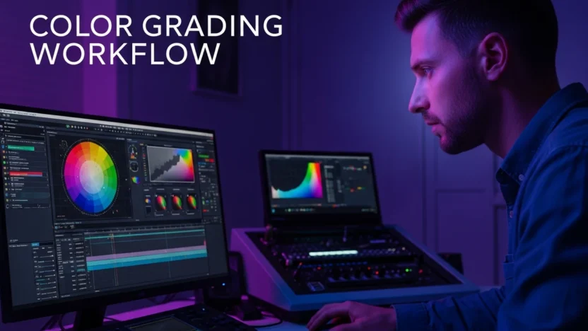
Image you can use: “editor at workstation / multi-monitor setup” (Unsplash)
5) Look development: build a look that survives bad shots 😈
A “real” look holds up when:
low light footage appears
mixed white balance happens
highlights clip
skin tones vary across actors and lighting
I build look in this order:
- Tone (contrast shape): curve shape > contrast slider addiction
- Palette (hue relationships): push the world, protect skin
- Density (saturation behavior): saturation distribution not just amount
- Texture (finish): add tactile choices late
Pro tip: your look should be stronger in midtones than in highlights. Highlights are where cheap grades look cheapest (neon clipping, crunchy speculars, over-sat skies).
6) Matching: the split-screen/stills grind that makes you look expensive 💅
Matching is where “good grade” becomes “professional grade.”
How I do it:
- Lock hero shots per scene
- Use stills / split-screen to compare the whole scene against the hero
- Match in this order: exposure → WB → saturation → contrast shape → palette nuance
- Only then do secondaries
If you do secondaries before matching, you’ll waste time tracking a window you’ll later invalidate by changing global exposure.
7) Refinement: secondaries that don’t scream “I used a qualifier” 🥷
Secondaries are where people either level up or create plastic nightmares.
My rules:
- Windows should be motivated (light direction / story intent), not “because face.”
- Keys should be gentle (wide, soft, and stable), not razor-thin.
- Tracking should be invisible: if the viewer notices it, you overdid it.
Common refinement moves that read “pro”:
- subtle face exposure lift without flattening contrast
- skin hue alignment on vectorscope without Barbie saturation
- practicals (lamps/neon) controlled so they feel bright, not clipped
- skies held without creating banding or cyan sludge
8) Texture pass: film feel is a system, not a plugin 🎞️
Texture choices should support the project’s aesthetic:
grain structure, halation/glow, mild sharpening (or softness), and sometimes gate weave/film rolloff emulation.
If you do texture early, you’ll fight it the entire session. Texture is last because it masks small issues, and it changes perceived contrast.
9) Monitoring, calibration, and why clients sabotage grades 🙃
If your monitoring isn’t trustworthy, you’re grading vibes.
Baseline pro setup concepts:
- consistent viewing environment (neutral wall, controlled light)
- calibrated display target (commonly Rec.709 / gamma 2.4 / D65 for SDR)
- ideally external monitoring path (so the OS doesn’t “help”)
Client workflow reality:
If they review on a laptop at max brightness at noon, they will ask for “more contrast” until it looks like charcoal. You prevent this by setting expectations: which device matters, which notes are actionable, and how review will happen.
10) QC & deliverables: make it legally boring ✅
Before export, I check:
- clipping (especially in highlights)
- legal levels / broadcast safe (if required)
- saturation extremes (vectorscope spikes)
- gamut issues for target deliverable
- consistency across scene transitions
Deliverables aren’t glamorous, but they’re where projects fail.