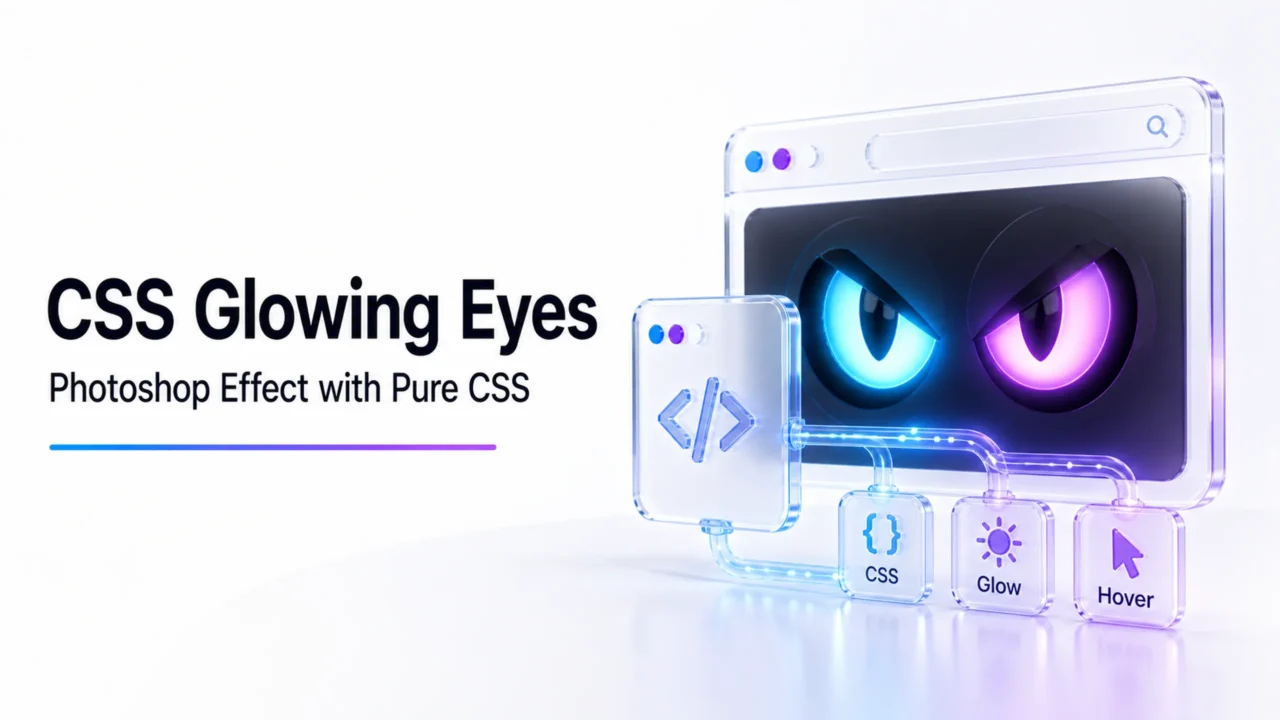
To create a glowing eyes effect using CSS only, you can combine HTML structure for the face/eyes with CSS box-shadow properties to generate the aura, and @keyframes animations to create a pulsing “breathing” light effect.
Here is a complete, ready-to-use example.
HTML Structure
This sets up a simple dark face container holding two eyes, with each eye containing a pupil that holds the main glow.
The magic relies on layering multiple box-shadow values. The first layer provides a bright white core, while the subsequent layers use increasingly larger blur radii with a neon color to create the ambient light.
/* Background environment for maximum contrast */
body {
  margin: 0;
  height: 100vh;
  display: flex;
  justify-content: center;
  align-items: center;
  background-color: #0b0c10; /* Dark background is essential for neon effects */
}

/* Face container */
.face {
  display: flex;
  gap: 60px; /* Space between the eyes */
}

/* Base eye structure */
.eye {
  width: 80px;
  height: 40px;
  background-color: #1f2833;
  border-radius: 50% / 100% 100% 0% 0%; /* Slanted, angry, or robotic eye shape */
  display: flex;
  justify-content: center;
  align-items: center;
  overflow: hidden;
  border: 2px solid #333;
}

/* The glowing pupil */
.pupil {
  width: 25px;
  height: 25px;
  background-color: #00f2fe; /* Base core color */
  border-radius: 50%;

  /* Infinite pulsing animation */
  animation: eye-glow 2s infinite ease-in-out alternate;
}

/* The Glow and Pulse Keyframes */
@keyframes eye-glow {
  0% {
    /* Subtle initial glow */
    background-color: #00c6ff;
    box-shadow:
      0 0 10px #00f2fe,
      0 0 20px #00f2fe,
      0 0 30px #00f2fe;
  }
  100% {
    /* Intense expanded glow */
    background-color: #ffffff; /* Bright core shifts to white at peak intensity */
    box-shadow:
      0 0 5px #ffffff,   /* Sharp white core reflection */
      0 0 15px #00f2fe,  /* Bright inner color halo */
      0 0 35px #00f2fe,  /* Mid-level color dispersion */
      0 0 60px #00c6ff,  /* Distant soft ambient light bleed */
      0 0 90px #00c6ff;
    transform: scale(1.1); /* Optional: makes the pupil physically breathe */
  }
}
Key Techniques Explained
Dark Backdrop: Glow effects always look washed out on light backgrounds. Using a dark color like #0b0c10 provides the necessary visual contrast.
Shadow Layering: By comma-separating multiple values in box-shadow, you stack light properties. The smaller blur values (e.g., 5px) handle the sharp intensity, while large values (e.g., 90px) handle the ambient room illumination.
Alternate Animation Loop: Using animation-direction: alternate; ensures the pulse flows smoothly back and forth from faint to intense without any abrupt visual snaps.
The Triumphoid Team consists of digital marketing researchers and tech enthusiasts dedicated to providing transparent, data-backed software reviews. Our content is independently researched and fact-checked